Silmaril
- Services
- Brand Strategy, Brand Identity, Graphic Design, Web Design, Copywriting, Full-Stack Development
- Sector
- Tech & SaaS
- Year
- 2026
Introduction
Silmaril builds technology to find public contracts and funding across Europe, a market of more than two trillion euros a year spread over dozens of countries, languages and portals. They had a new product and a clear goal, raising a Series A, but their website dated from before the startup knew what it would do and described a different project: “La nueva forma de entender la información”, over a stock photo. It was like having no website. An investor, and the CEO of a large company, had to understand in seconds what they do and why it matters.
The strategy
From “another AI tool” to the intelligence layer of European public procurement
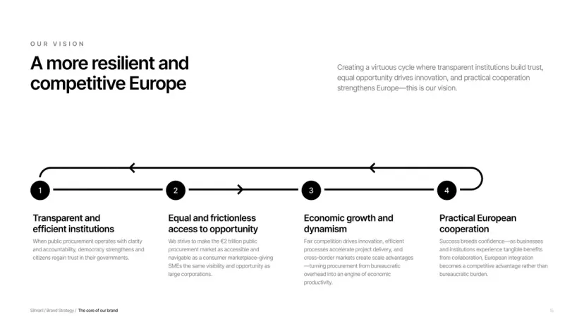
Before drawing anything we had to decide what Silmaril is. In a strategy workshop with the founders we defined who it serves (the CEO of an industrial, energy or infrastructure company that wants to grow in European public procurement), what it promises and how it speaks: a technology company, not a consultancy, and not one more piece of AI hype.
The result was a full brand strategy report: a vision (a more resilient and competitive Europe), the value proposition, messages per audience, the tone of voice and a product in three pieces that fits in one line: Hound discovers, Beacon filters, Atlas prepares. On that base we also wrote the go-to-market strategy.
The brand
A brand with the weight of an institution
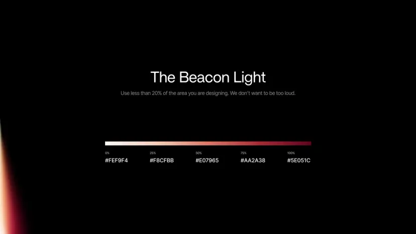
The identity had to say what the strategy said: rigour, not one more startup. We explored three visual routes and built a sober brand in black and white, with a geometric symbol and a logotype that hold up the same on a slide as in an email signature.
The only colour is a light, the Beacon Light: a lighthouse beam that guides through the fog of public bureaucracy and brings out the opportunities hidden in it, which is exactly what the product does. It all went into a brand kit with the logo, the colours, the type (Britti Sans and Inter) and the composition rules.
The website
A website a CEO understands in thirty seconds
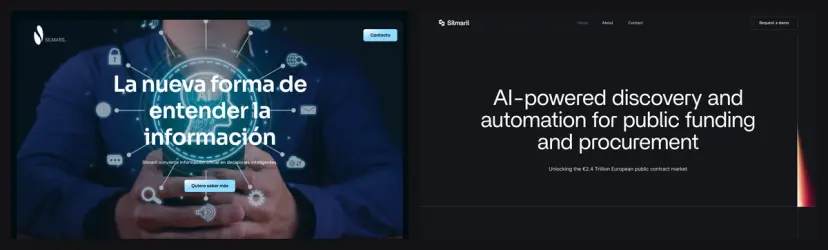
The old website dated from before Silmaril knew what it would do: it talked about “understanding information” over a stock photo because there was no product yet to talk about. We designed the new one from the message: what Silmaril does, the three pieces of the product and the size of the market, with a page per product, the private area for clients and a landing page for South Summit.
When the investors’ view came in (more restraint, with Palantir as the reference) we reworked all twelve pages in that direction: out went the repeated calls to action, the sales language and the product screenshots on the home page. A CEO gets it in under thirty seconds.
The round
The Series A deck, and a product already wearing the brand
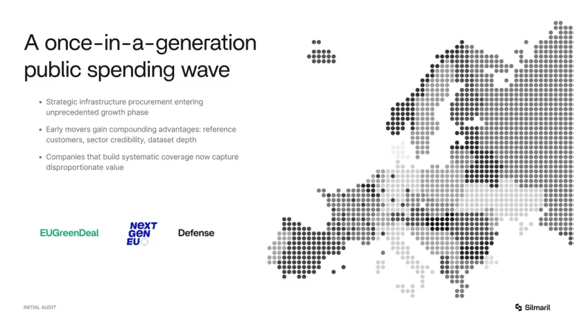
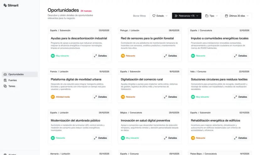
For the round we designed the Series A pitch deck: the architecture of the story (problem, market, product, traction, team and the ask) on proven investor frameworks, written and laid out in the new brand. Plus a proposal template so the sales team presents in the same voice.
Since the product gets shown too, we redesigned key screens of the app in the new identity as the reference for their development team, which applied it to the rest of the tool.
In short
Ready for the Series A: a plan that builds traction and a presence investors trust.
Tools
FigmaWebflow
 Figma
Figma Webflow