Gestek
- Services
- Brand Strategy, Brand Identity, Naming, Web Design, Webflow Development, Copywriting
- Sector
- Industry
- Year
- 2022
Introduction
Gestek was founded in 1997 in Torrefarrera (Lleida) as Gestiones y Técnicas Veterinarias de Lleida, Gestevet to everyone. Twenty-five years later the work was no longer that: industrial water treatment, biosecurity and hygiene, research and training for factories, cooperatives and farms. The name still pointed back at the beginning, and the website was a catalogue: a menu with ten services and seven product families, a gallery and a PDF to download. They asked us for all three pieces at once: the name, the brand and the website.
The name
Twenty-four names across three rounds, to be able to drop three letters
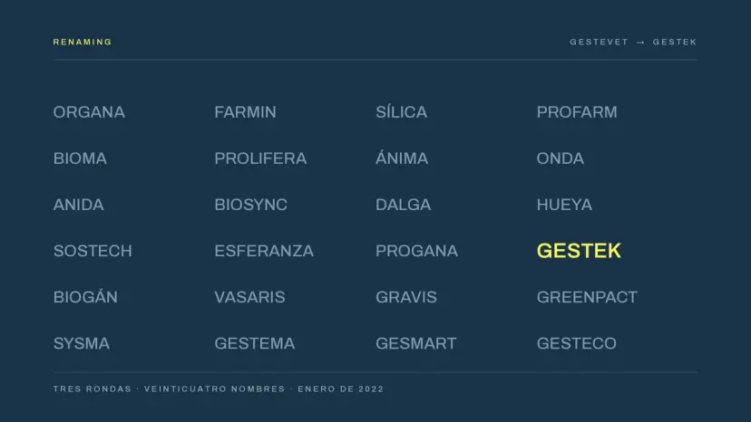
Gestevet came from “Gestiones y Técnicas Veterinarias”. The first two words were still true; the third was not: most of the business was water and industrial hygiene, and the “vet” closed doors at factories without a single animal in them. The brief was literal: take the VET out. On two conditions: it had to be pronounced the same in Catalan and Spanish, and it had to bend into product names.
We ran three rounds and presented twenty-four names. The first was all farms (Organa, Bioma, Ánima) and, on seeing it, the brief itself moved: less livestock, more versatile, greener. Gestek turned up in the second round and won in the third: Gestión and Tecnología, the two words the company already had, with a final K that closes the word and brings it into the present. The free domain was gestek.pro, and that is still where they are.
The brand
A water drop that is also a G, and a brand book so nobody misuses it
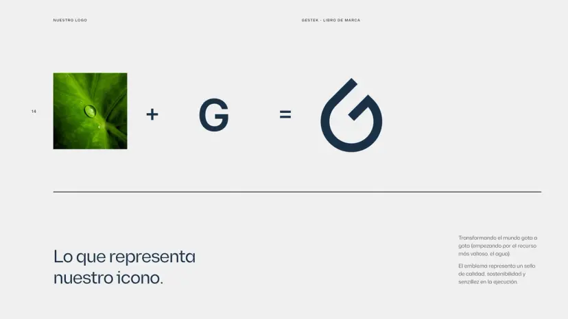
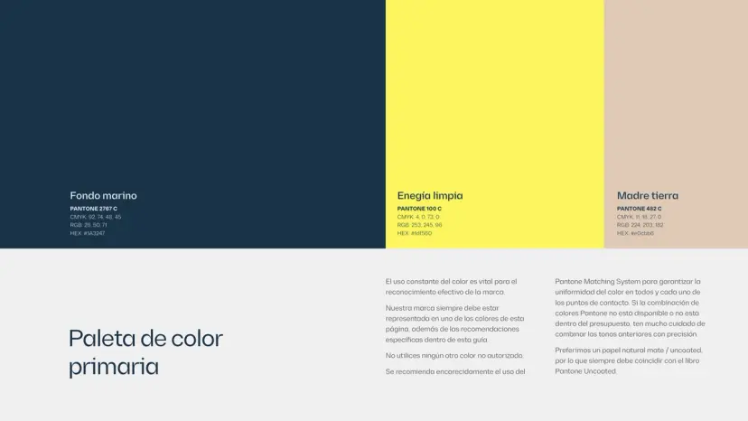
A name is not a brand. We prepared three look-and-feel routes as stylescapes and presented them together. The third won without discussion: robust, industrial, four colours, lines in movement. From there nothing had to be invented, it had to be built.
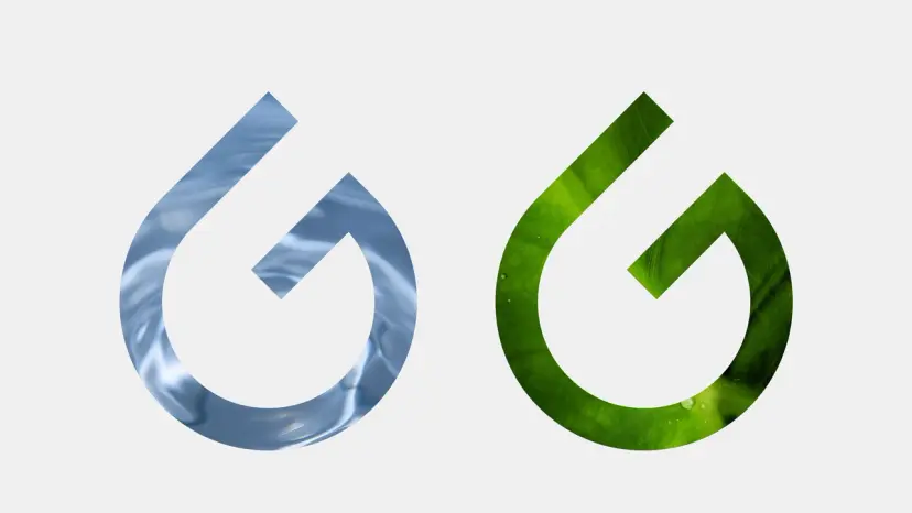
The icon is a water drop whose tail draws a G: the resource the company lives off, turned into its initial. Behind it sits the whole system: the palette (Fondo marino, Energía limpia and Madre tierra), the Diagramm typeface, the angled-corner box that frames them as engineering, and the masks, photographs seen through the icon. It all shipped as a forty-five-page brand book with the rules inside, so the brand outlives whoever is using it.
The website
Two families of service where there used to be seventeen menu entries
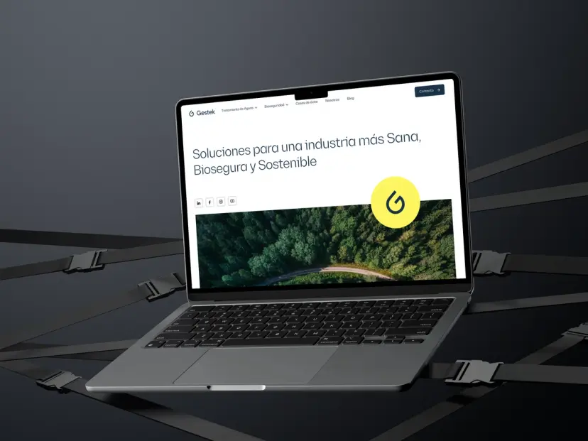
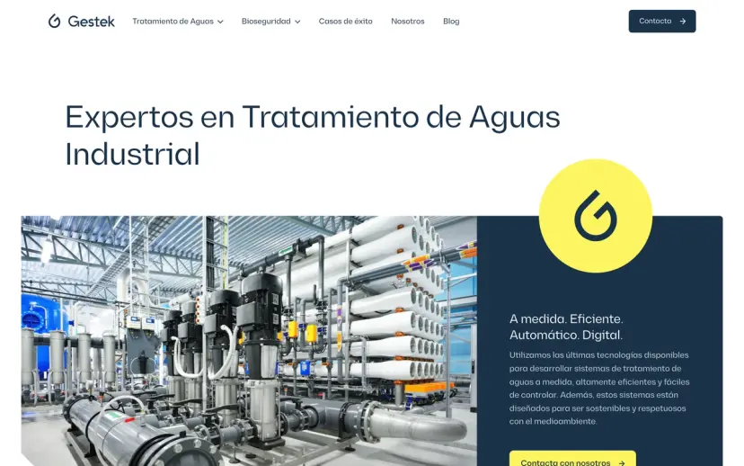
The old website put everything on the same level: ten services and seven product families hanging off the menu, plus a gallery, news and a catalogue PDF. You had to know in advance what you were looking for.
The new one, in Webflow, sorts itself into two families (water treatment and biosecurity) plus research and training, with every line written from scratch and the brand applied throughout. And with a CMS: they publish the blog themselves, and the success stories too, one installation at a time. It has been running since the summer of 2022 and is still theirs. Then came four more years of maintenance, month-by-month marketing planning and an Airtable system for quotes, orders, analysis invoices and new-client sign-ups.
In short
A name that looks forward without disowning the twenty-five years holding it up.
Tools
FigmaWebflow
 Figma
Figma Webflow